~75%
Active portal screens migrated during the initial rollout phase.Portal screen coverage
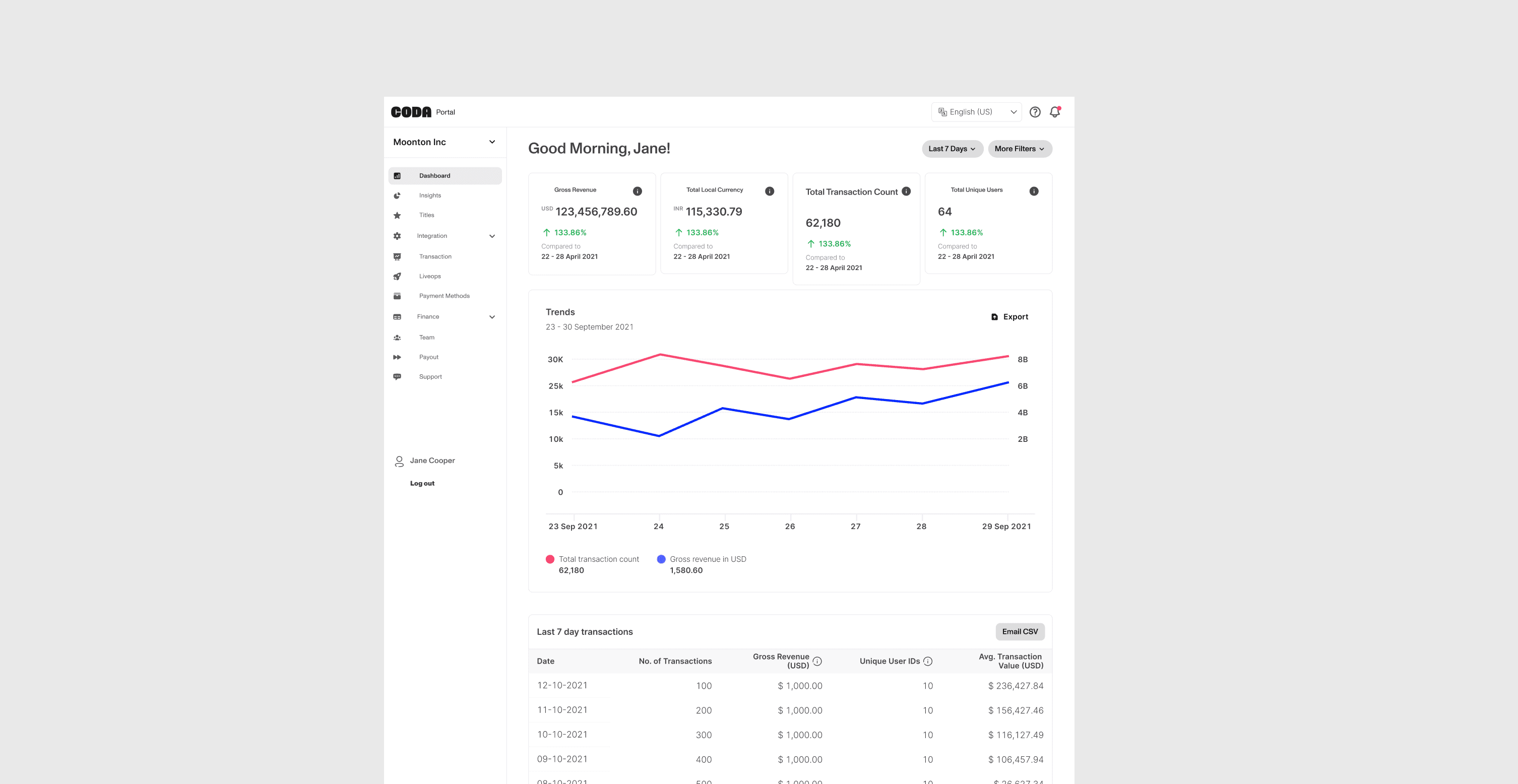
We brought Coda's Publisher Portal closer to its new brand and built reusable foundations, components, and patterns for product teams to work from.
Some numbers, data, and statements have been altered to respect confidentiality agreements.
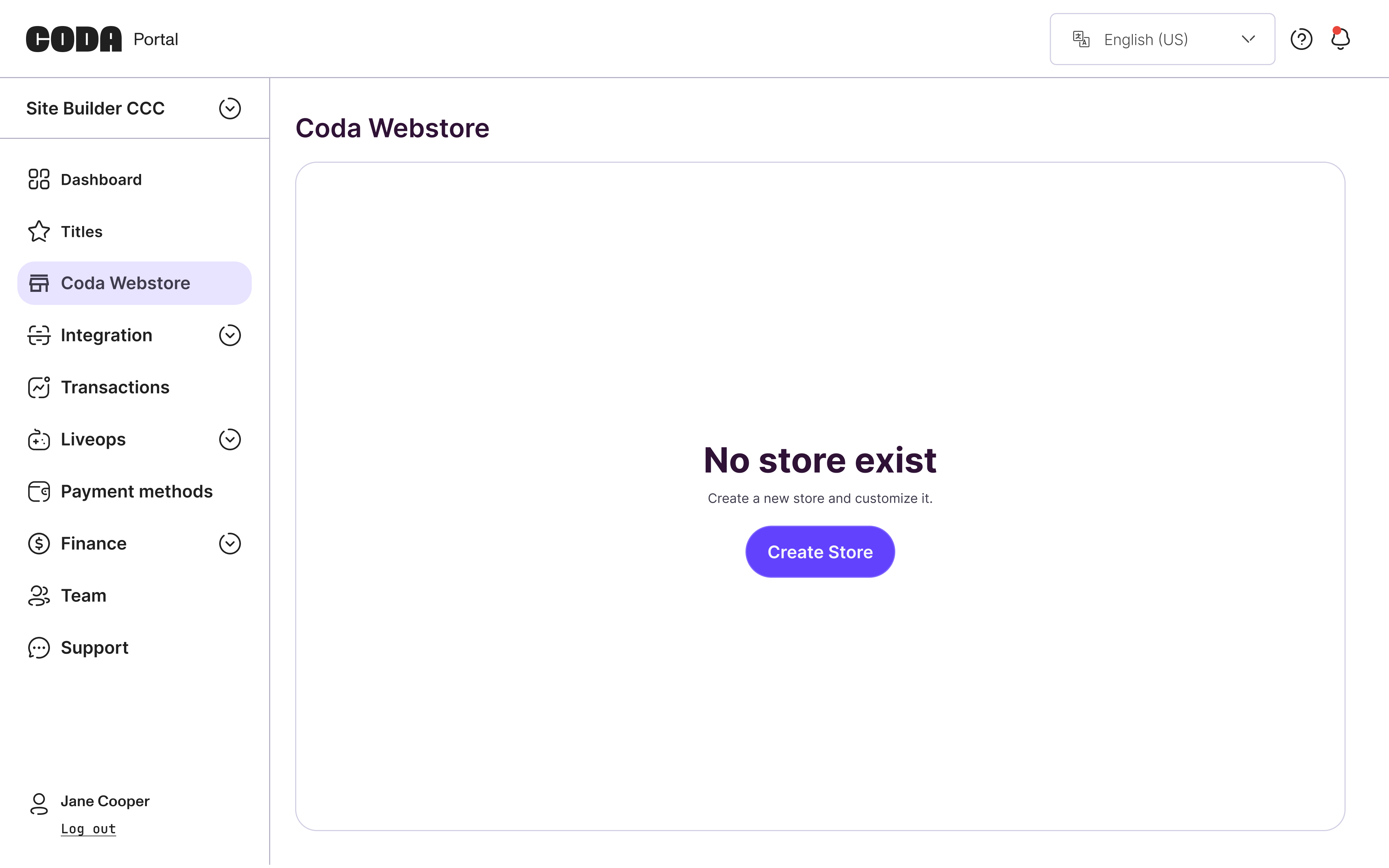
How might we bring the Publisher Portal into line with Coda's new brand while reducing the UI work teams repeat for every feature?
From a Visual Refresh to a Shared Product Foundation
Coda's new brand made the Publisher Portal's older visual language feel disconnected from the company it represented. The brief began as a visual refresh, but our audit revealed a broader problem: squads were repeatedly designing and building similar UI without shared rules. We expanded the work into a design system, investing frontend capacity upfront to give teams a reusable foundation for the portal and internal admin tools.
I was one of two product designers. To work within our available capacity, I owned three areas: system foundations—including typography, spacing, and icons; navigation and onboarding guidance; and core input and feedback components, including tooltips, banners, snackbars, radio buttons, checkboxes, and toggles.
My design partner led the more complex, data-heavy components and patterns, including tables and data visualization. We aligned both workstreams within the shared system and jointly contributed to its documentation and governance.
Portal screen coverage
Fewer story points
Design iteration
New admin-tool adoption
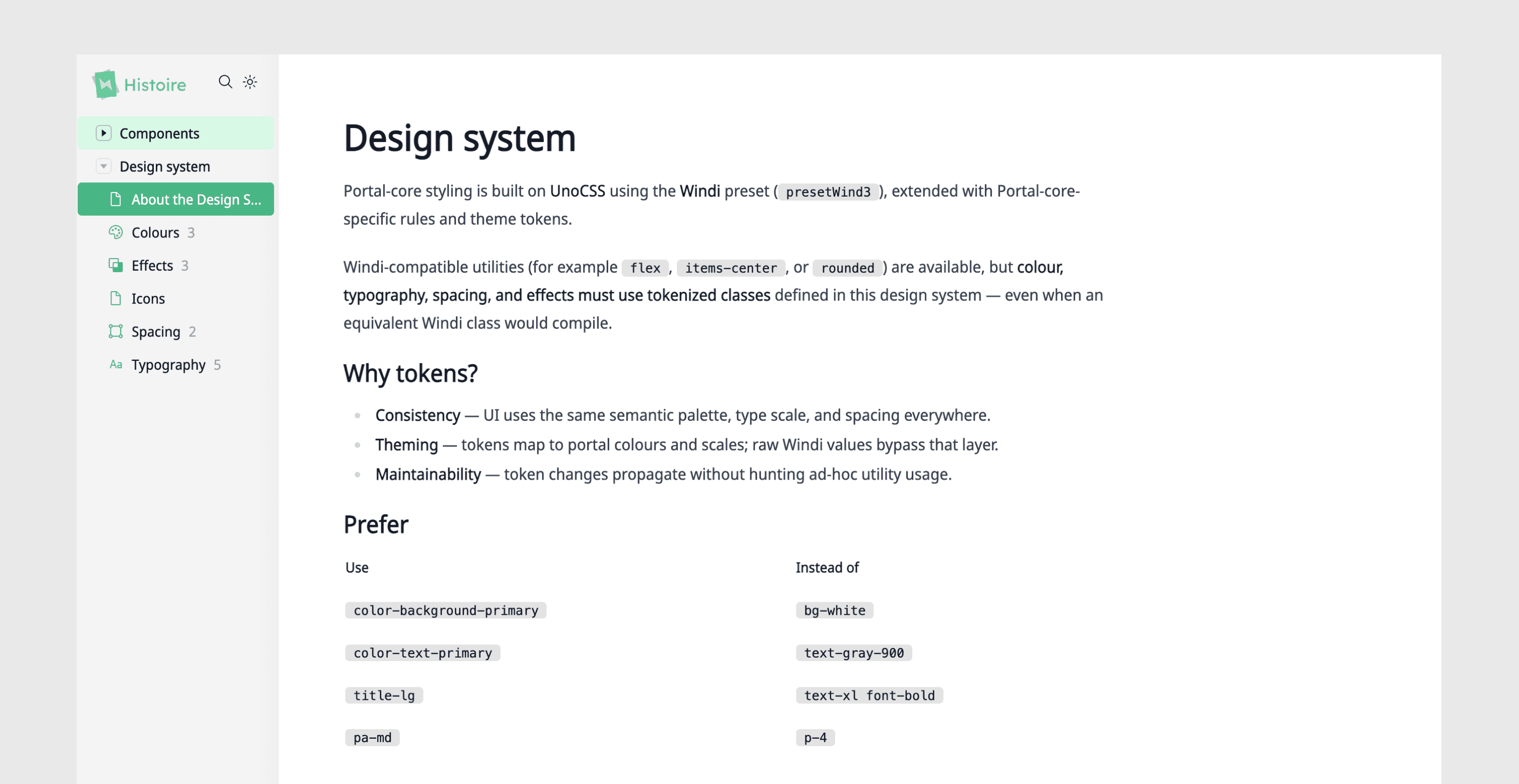
Shared tokens and component documentation gave designers and frontend engineers a common reference for appearance, states, and behavior. Teams could reuse those decisions across features instead of defining them again in each handoff.
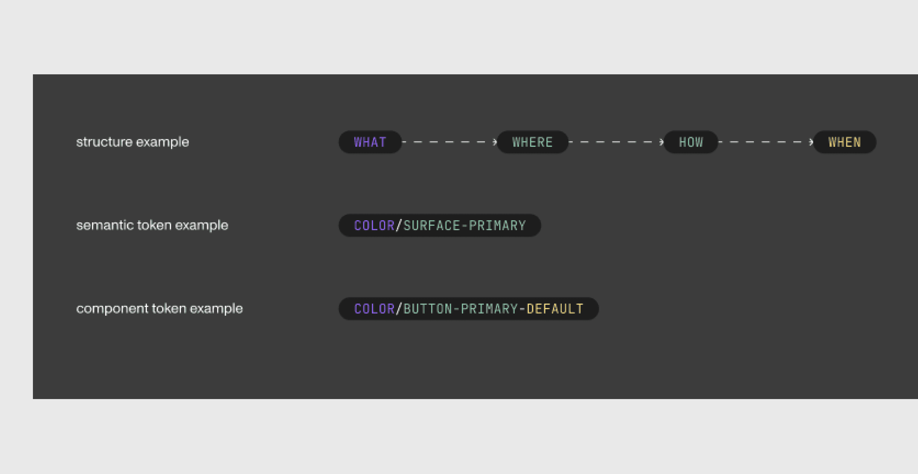
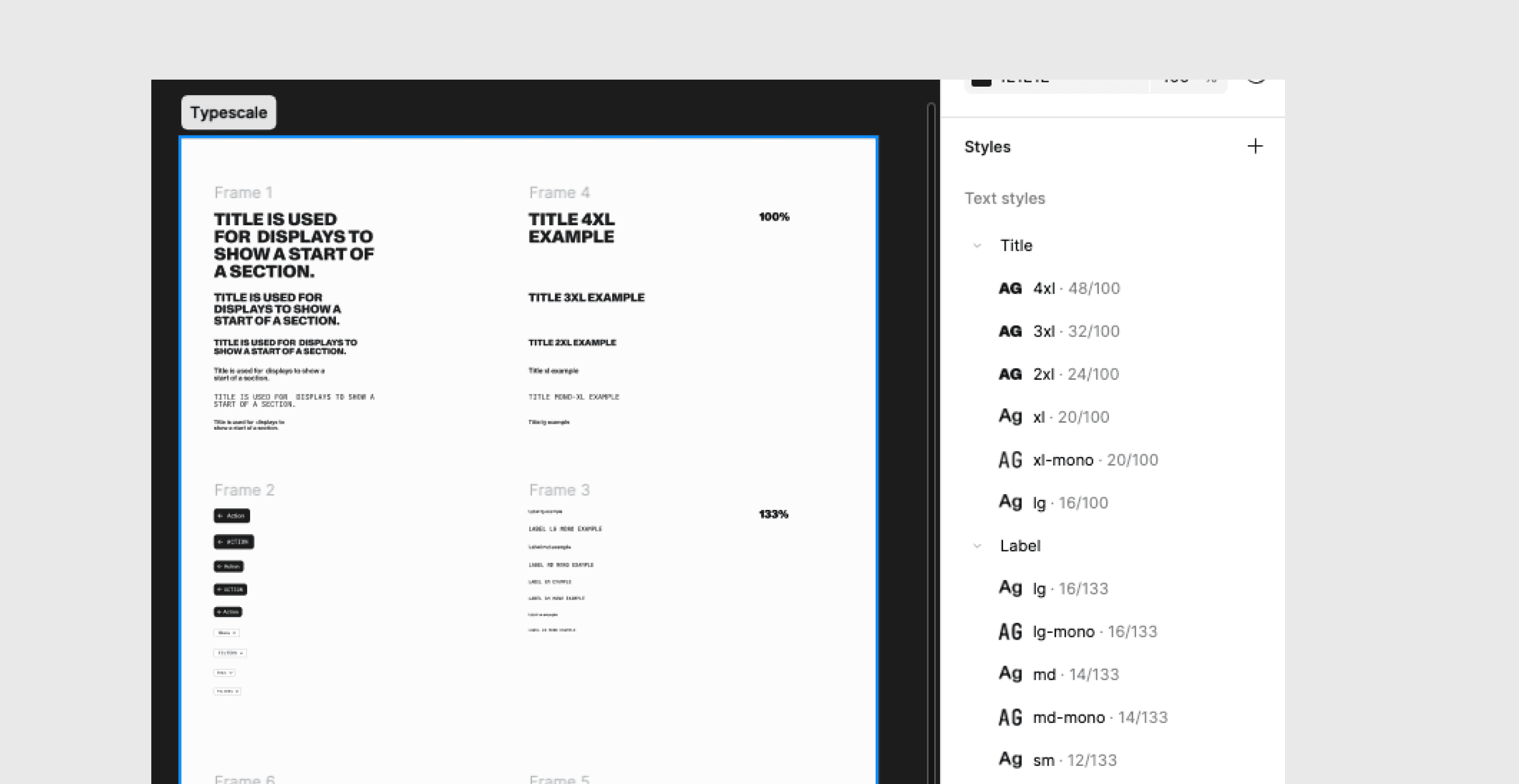
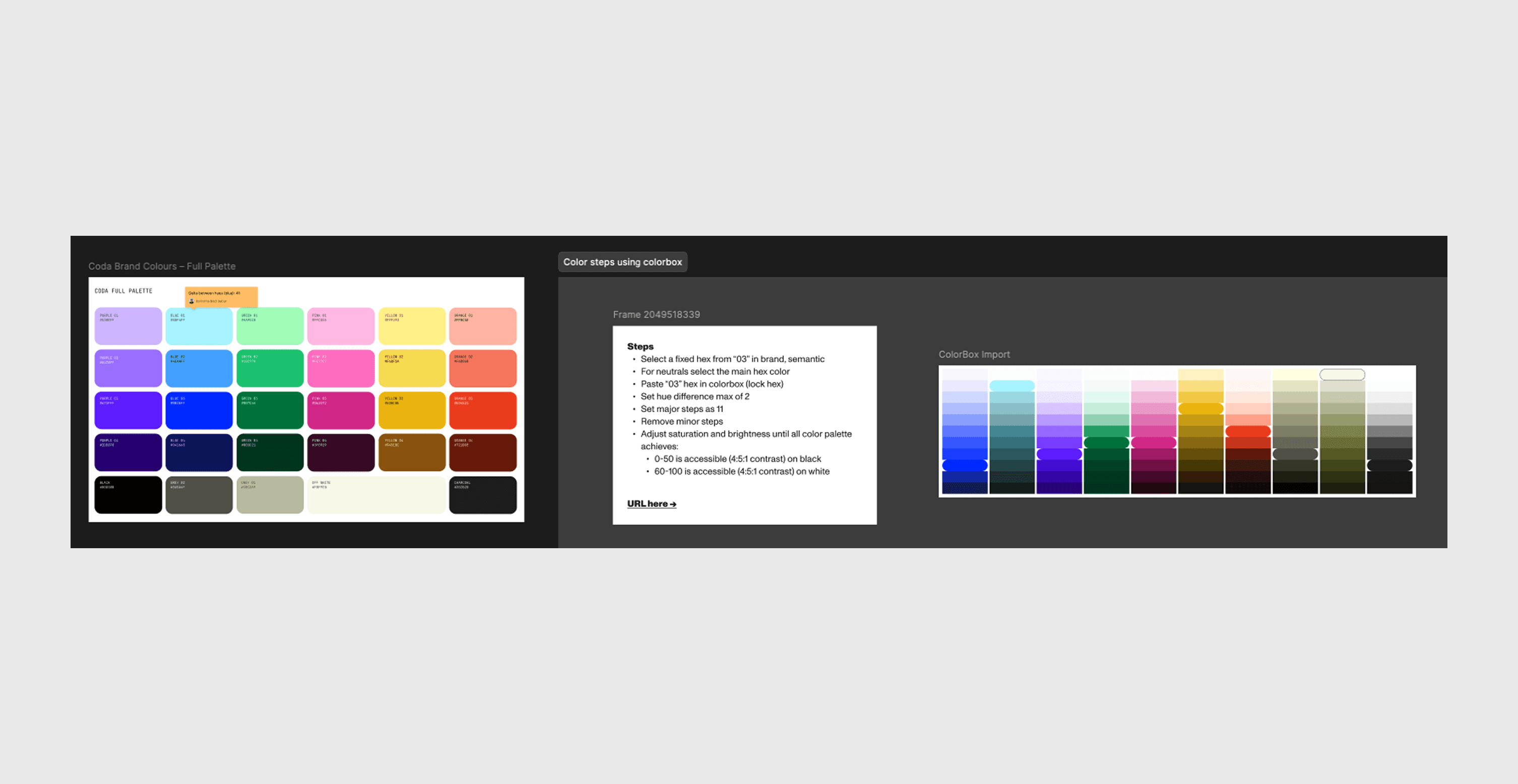
We translated the refreshed Coda identity into reusable color, typography, elevation, and spacing rules. These foundations connected the brand to everyday portal UI and provided a baseline for consistency and accessibility.
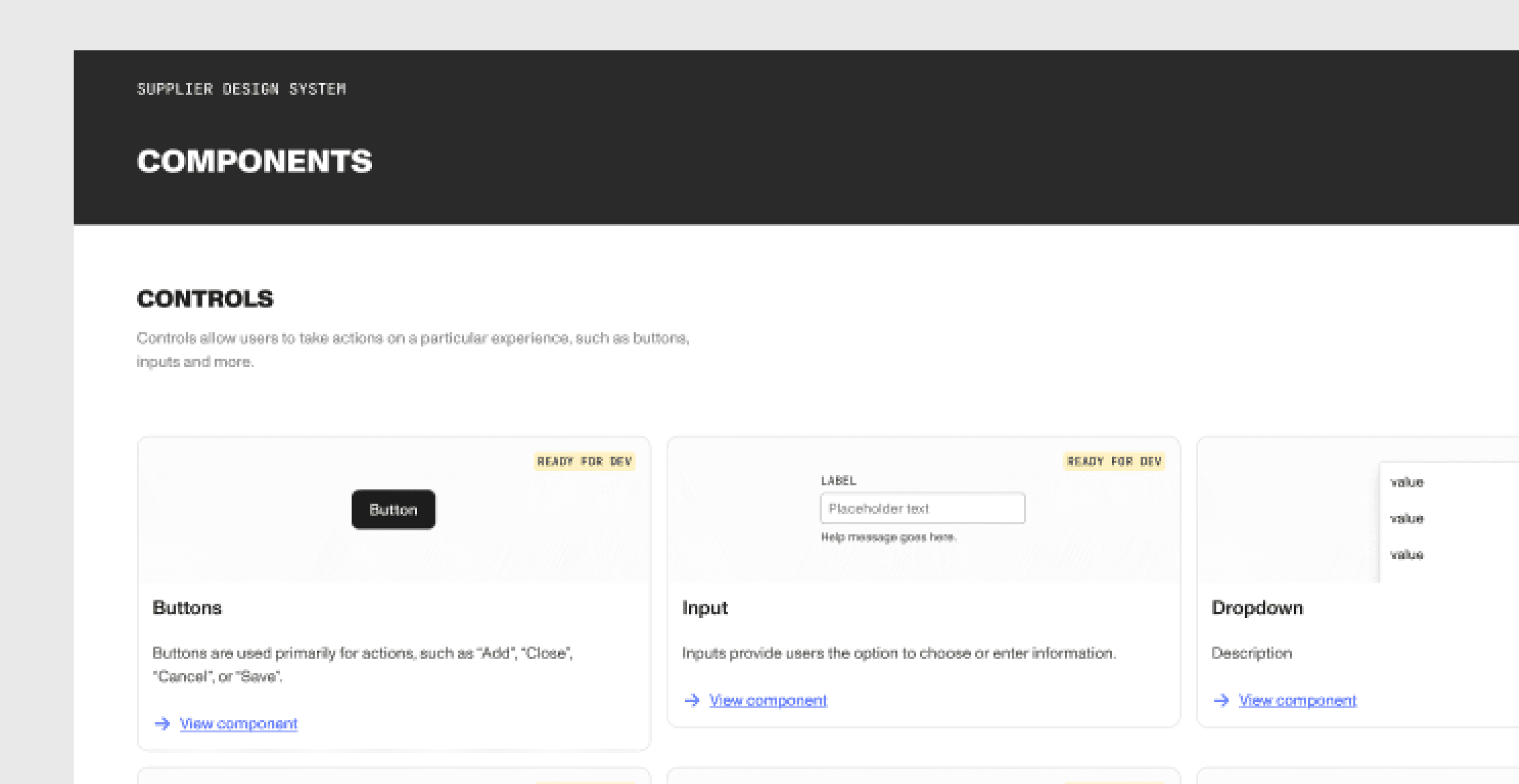
The library brought together form controls, feedback components, navigation, and data-heavy UI. Recurring workflow patterns showed how those pieces could work together, helping teams build on the shared system as the portal evolved.
“This is actually our current best-looking product.”
Vice President, Product
“It really complements our new brand. Loving it!”
Brand team
“You guys are really clocking it.”
Frontend engineer, another squad
“We definitely need this for our other products as well.”
Executive stakeholder
Context
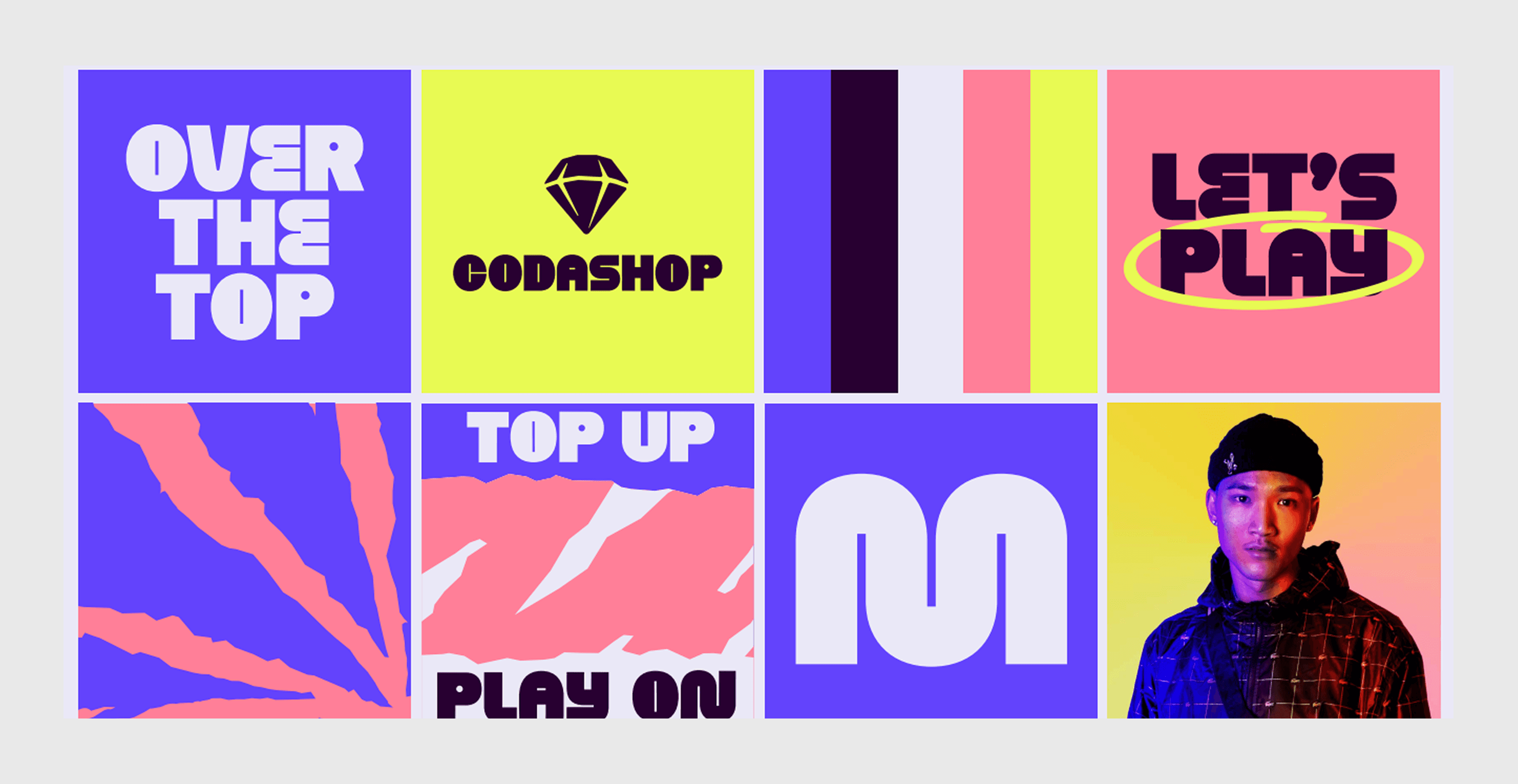
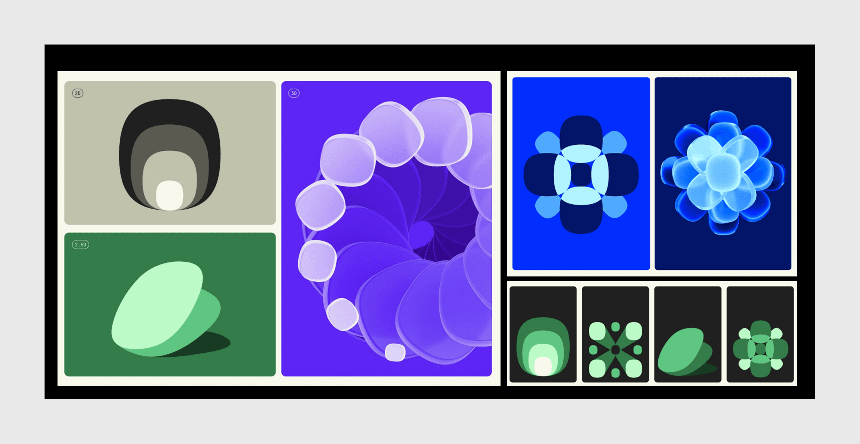
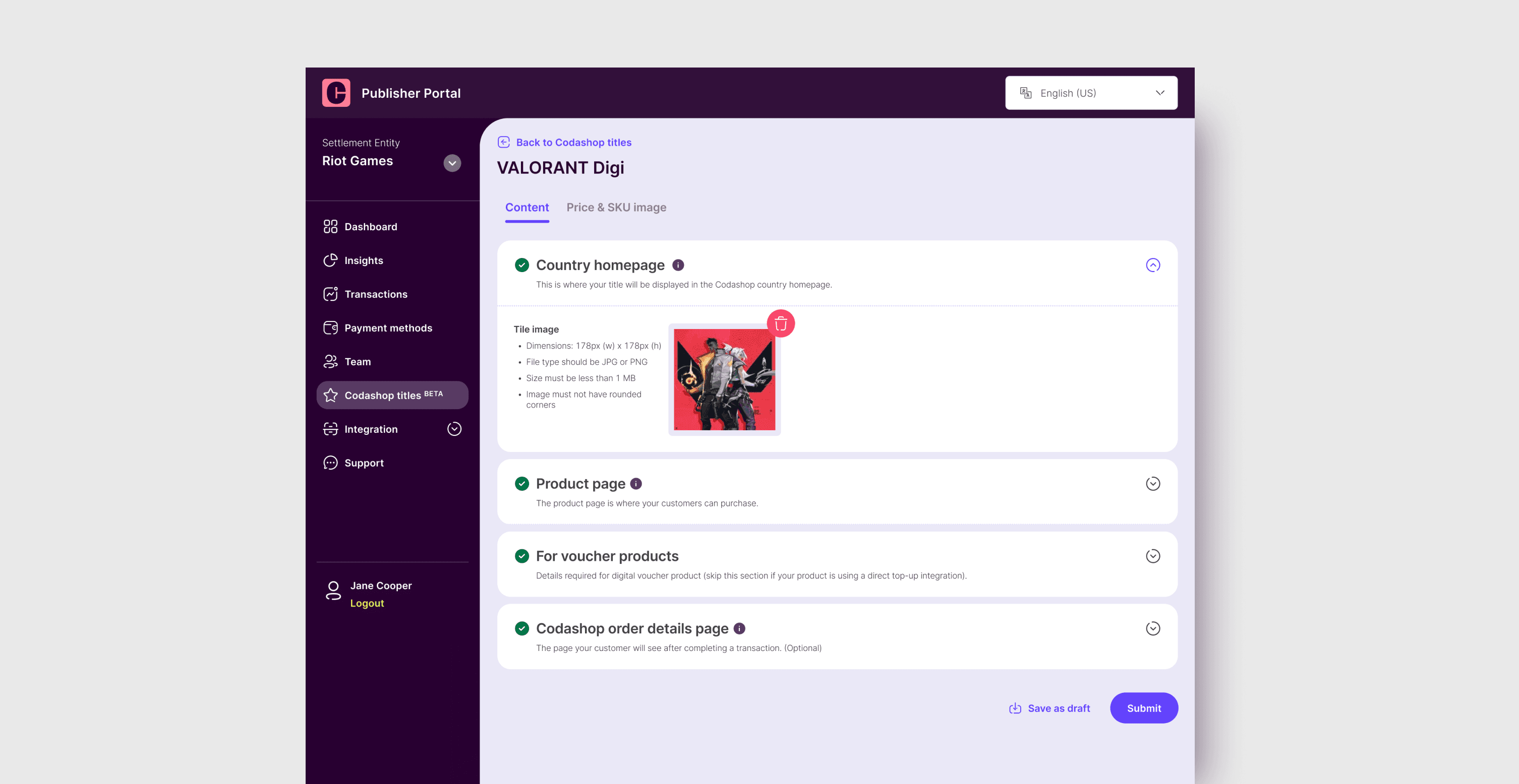
Coda's previous identity was bold, playful, and strongly associated with Codashop. As the company expanded beyond its consumer-facing roots, the brand team introduced a calmer, more mature direction.
The Publisher Portal still carried the old visual language. Side by side, the new Coda brand and the existing product barely felt like they belonged to the same company. Bringing them back into alignment became the initial brief.
Before redesigning the portal, we audited key workflows and compared how recurring patterns were represented across design and implementation.
The issue extended beyond appearance. Squads were solving similar interface needs separately, leaving component behavior, states, and implementation to be defined again for each feature. The audit pointed to four connected problems:
Reframing
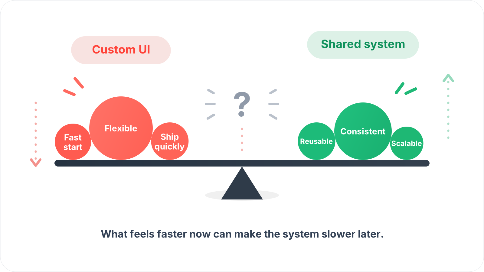
Other product managers were hesitant to adopt centralized UI standards because they feared a design system would slow active sprint delivery.
Their concern mattered: building shared UI would take time away from immediate feature work. At the same time, working independently meant squads kept paying the cost of designing, implementing, and maintaining similar patterns. We needed to make that tradeoff explicit.
The refresh still needed to bring the portal closer to Coda's brand. We added a second goal: give product teams reusable foundations and components so consistency could survive beyond the redesigned screens.
That broader goal connected the publisher-facing experience with the way squads designed and built it. It also required a larger commitment than a visual reskin.
That reframing also changed the cost of the project. Building the system properly would require most of our frontend capacity for the rest of the quarter, deliberately slowing progress on other product initiatives.
My manager brought the tradeoff to the wider product and engineering group: continue optimizing for short-term delivery, or invest in a shared foundation that could reduce repeated work and make future development more scalable.
The team chose the second path. That buy-in gave us space to treat the work as a platform initiative rather than a visual refresh squeezed between feature sprints.
Architecture
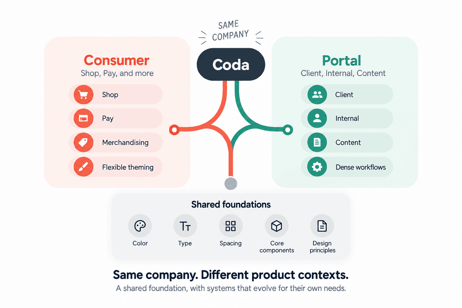
Before deciding how the system should be structured, we first needed to understand what should actually be shared.
Codashop and Publisher Portal both represented Coda, but they operated in very different product contexts. Codashop needed consumer-facing flexibility, publisher-specific theming, and merchandising patterns. Publisher Portal relied on dense operational UI such as forms, tables, validation, and multi-step workflows.
Forcing both products into one component system would have created the wrong constraints.
When we later built the Commerce Engine design system, its needs were fundamentally different from Publisher Portal. It had to support highly flexible branding and varied art direction across storefronts rather than a tightly controlled operational interface.
This later work reinforced the earlier choice: shared brand principles could connect the products while their components evolved around different workflows.
Exploration
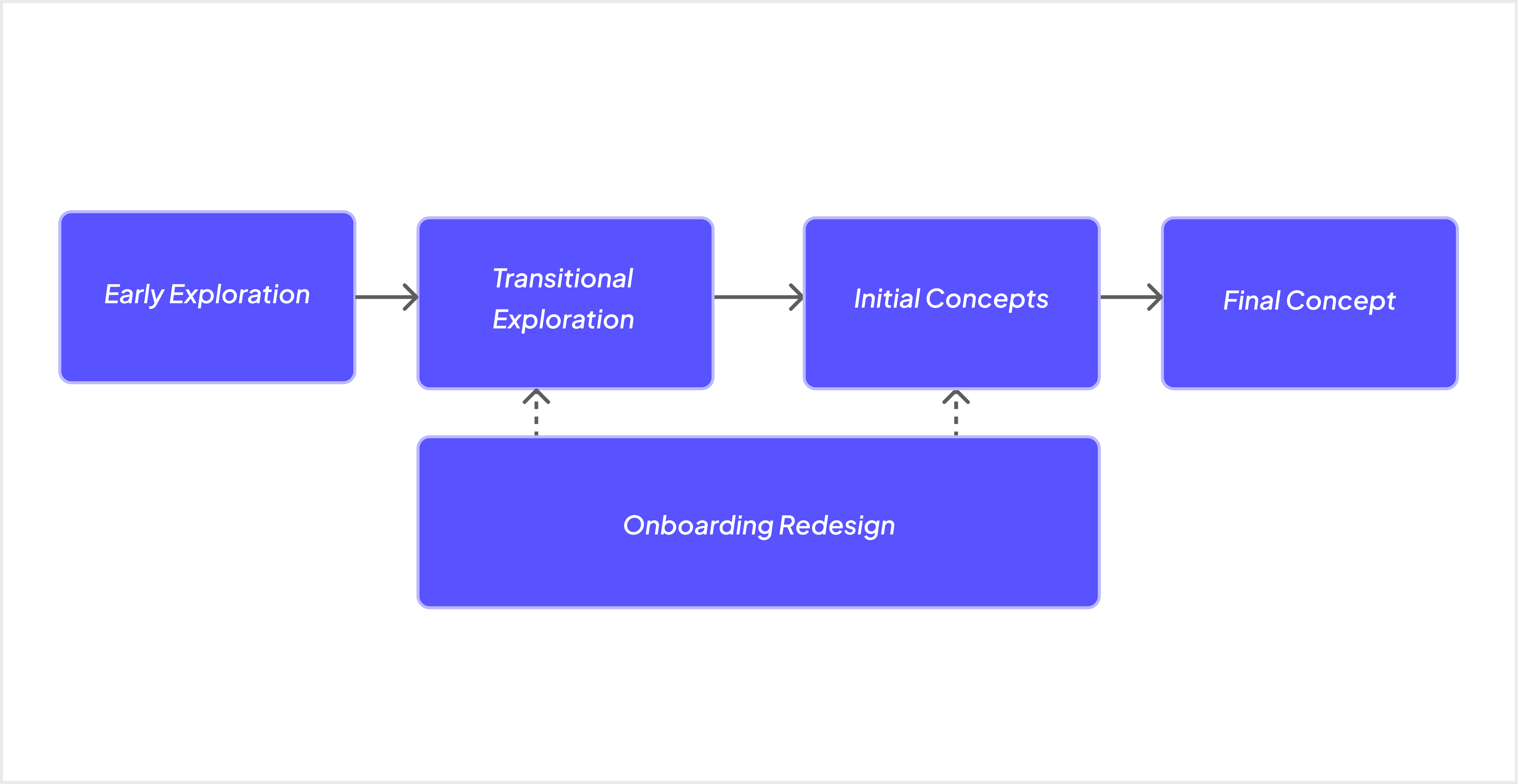
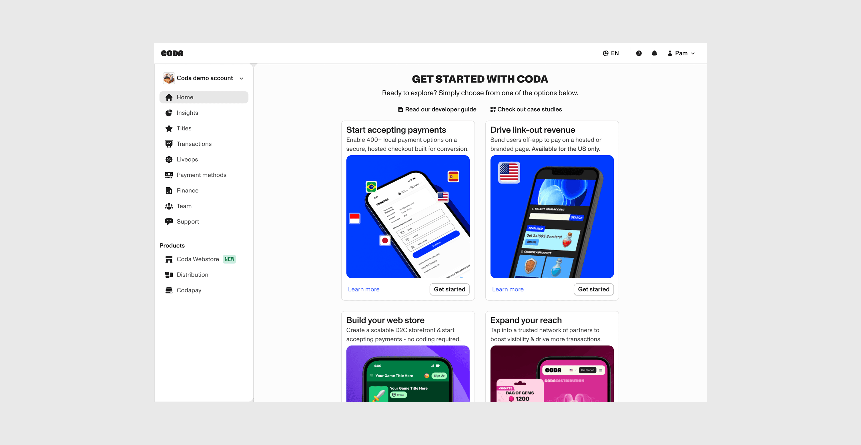
We continued exploring the portal's visual direction alongside the onboarding redesign. The system needed reusable rules that could support the current portal and adapt as navigation and product structure changed.
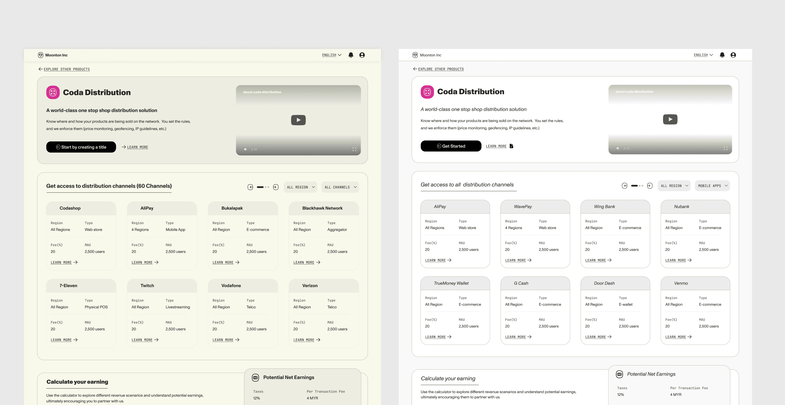
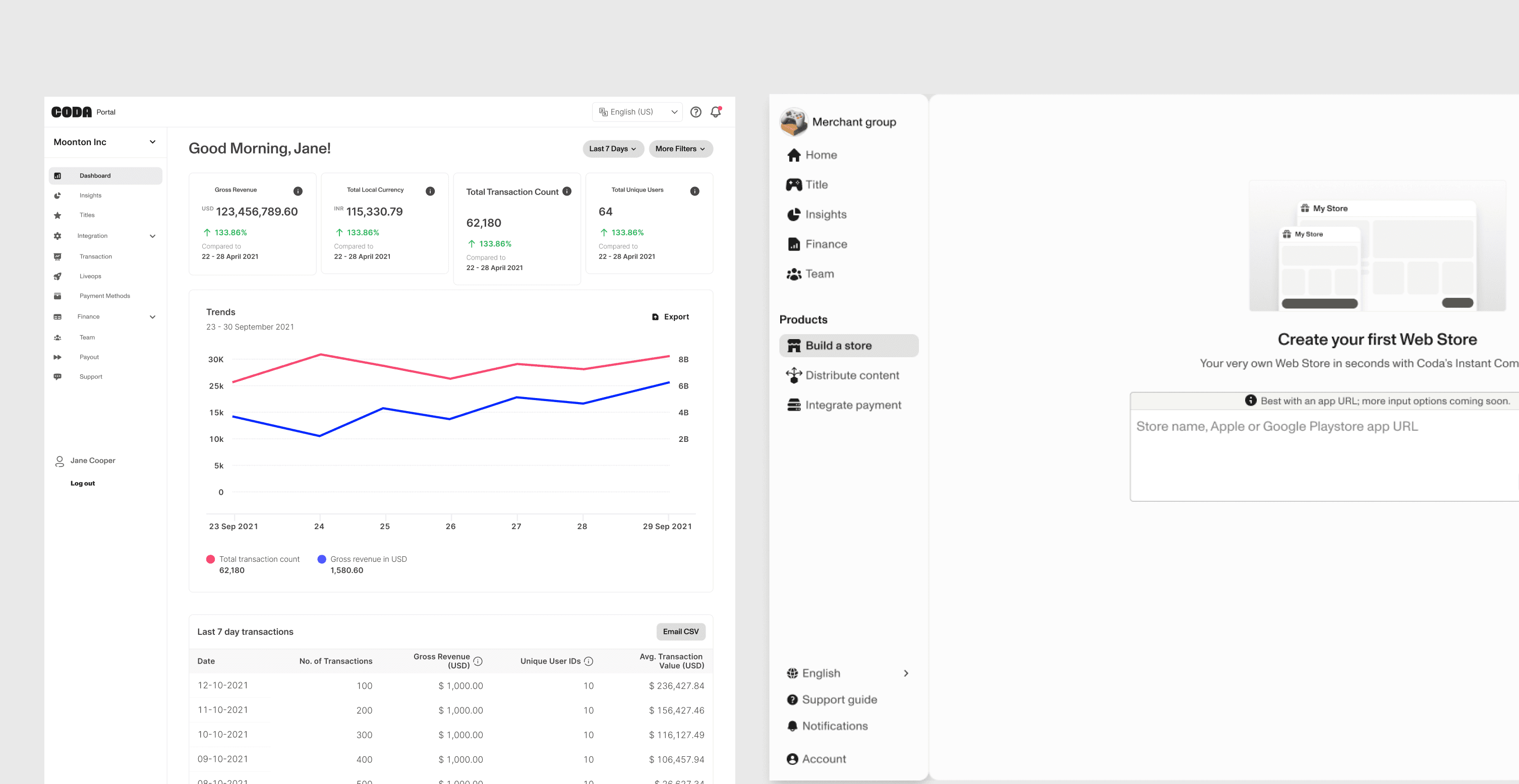
Early visual exploration was not yet reaching the quality bar we needed, so another designer stepped in to lead the visual direction and push the work closer to the new Coda brand.
At the same time, the onboarding work was rethinking how publishers discovered Coda's products, navigated between solutions, and moved toward launch. We were defining the foundation while both the visual language and the product structure it needed to support were still changing.
System layers
Once the system boundary was clear, we organized the Portal system from the most reusable decisions upward—starting with foundations, then components, and finally recurring product patterns. The goal was to centralize what should remain consistent while keeping higher-level patterns flexible enough for different workflows.
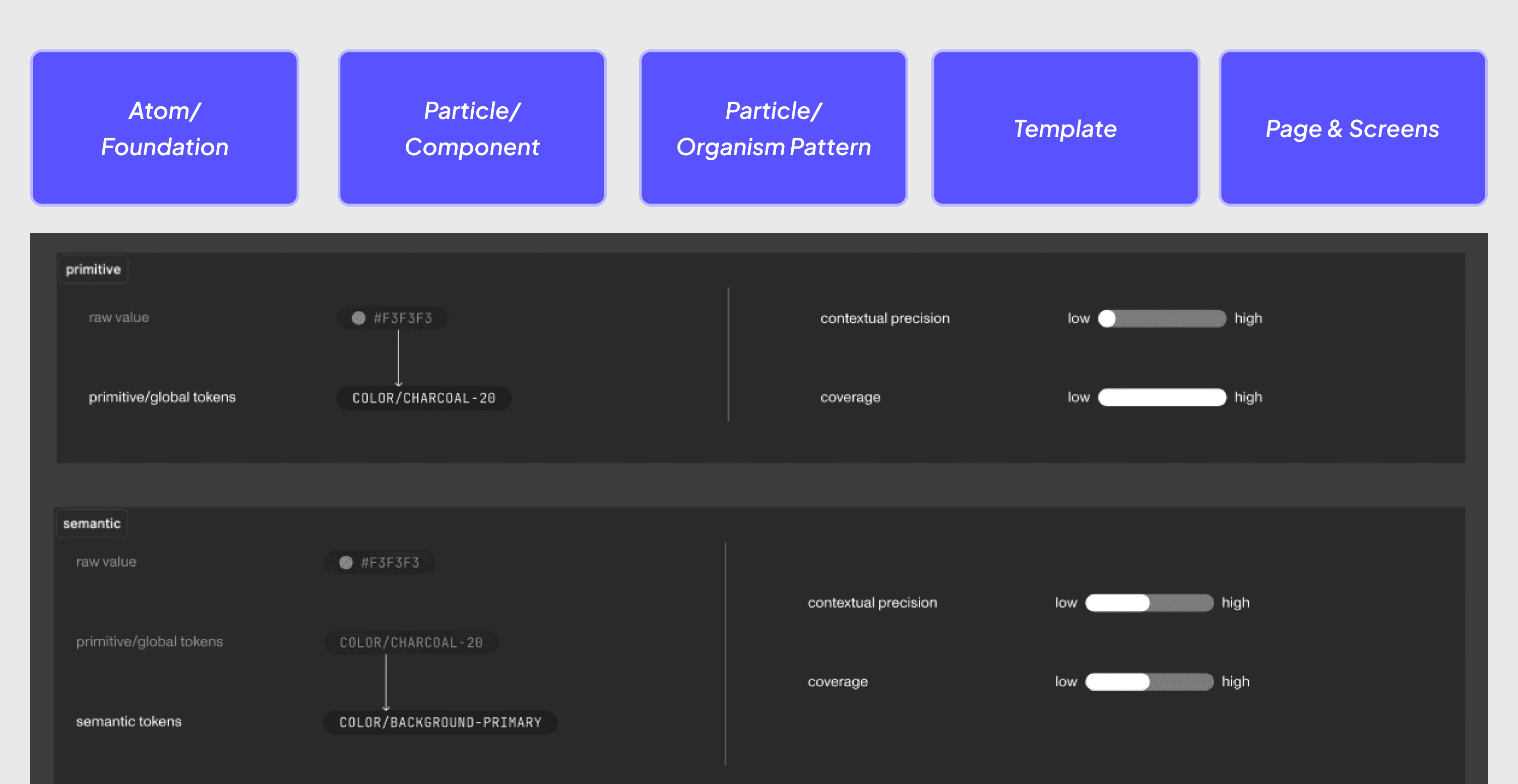
The shared visual and behavioral decisions that should remain consistent across the portal: color, typography, spacing, elevation, radii, states, and interaction principles. These foundations gave design and engineering a common baseline and reduced repeated low-level decisions across squads.
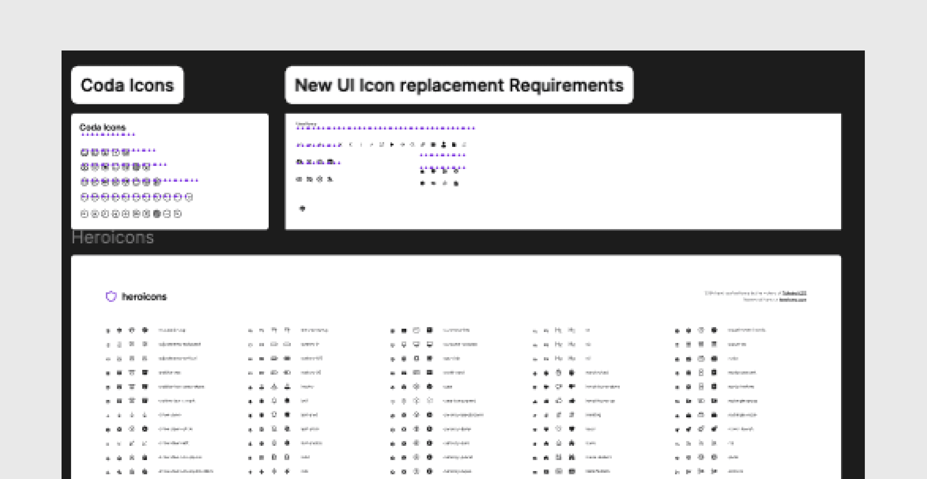
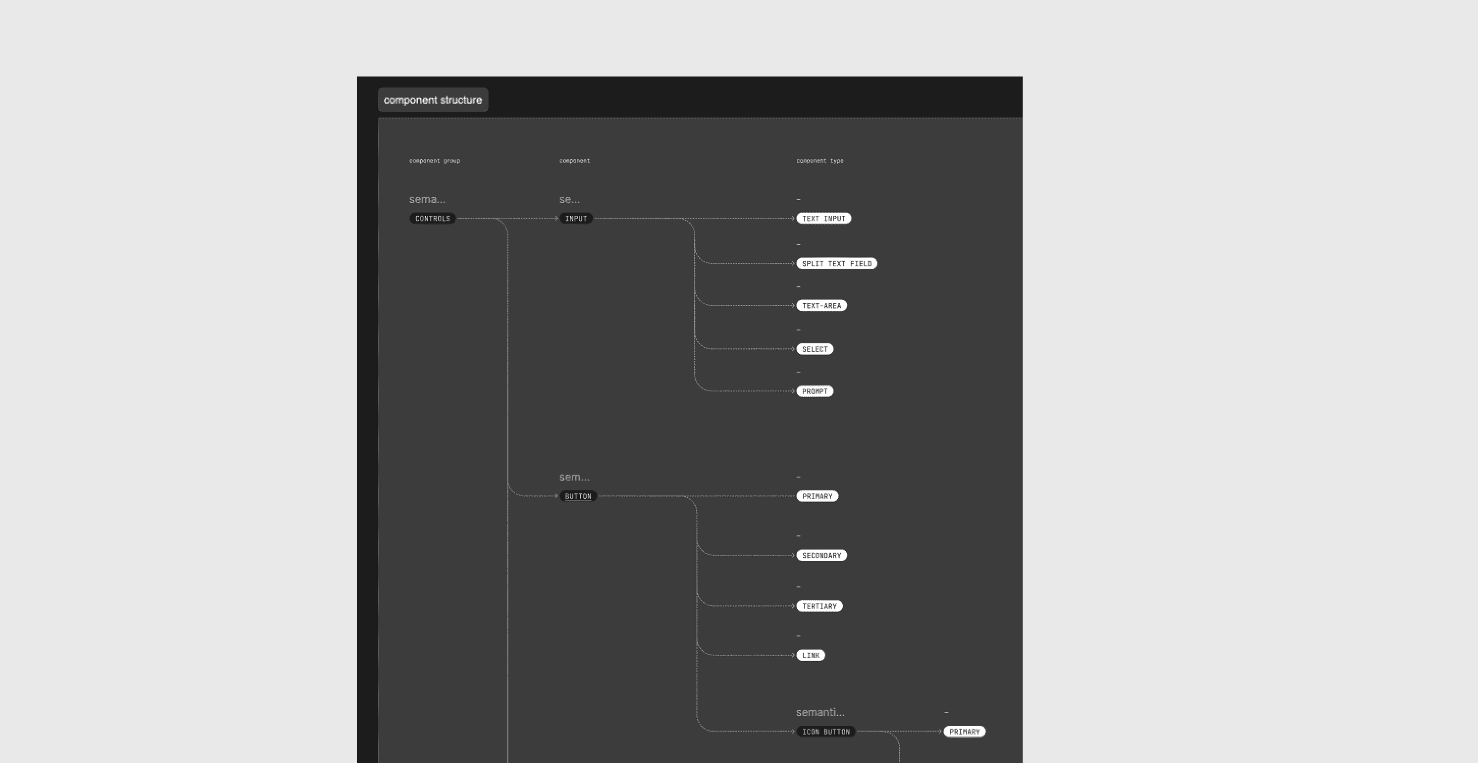
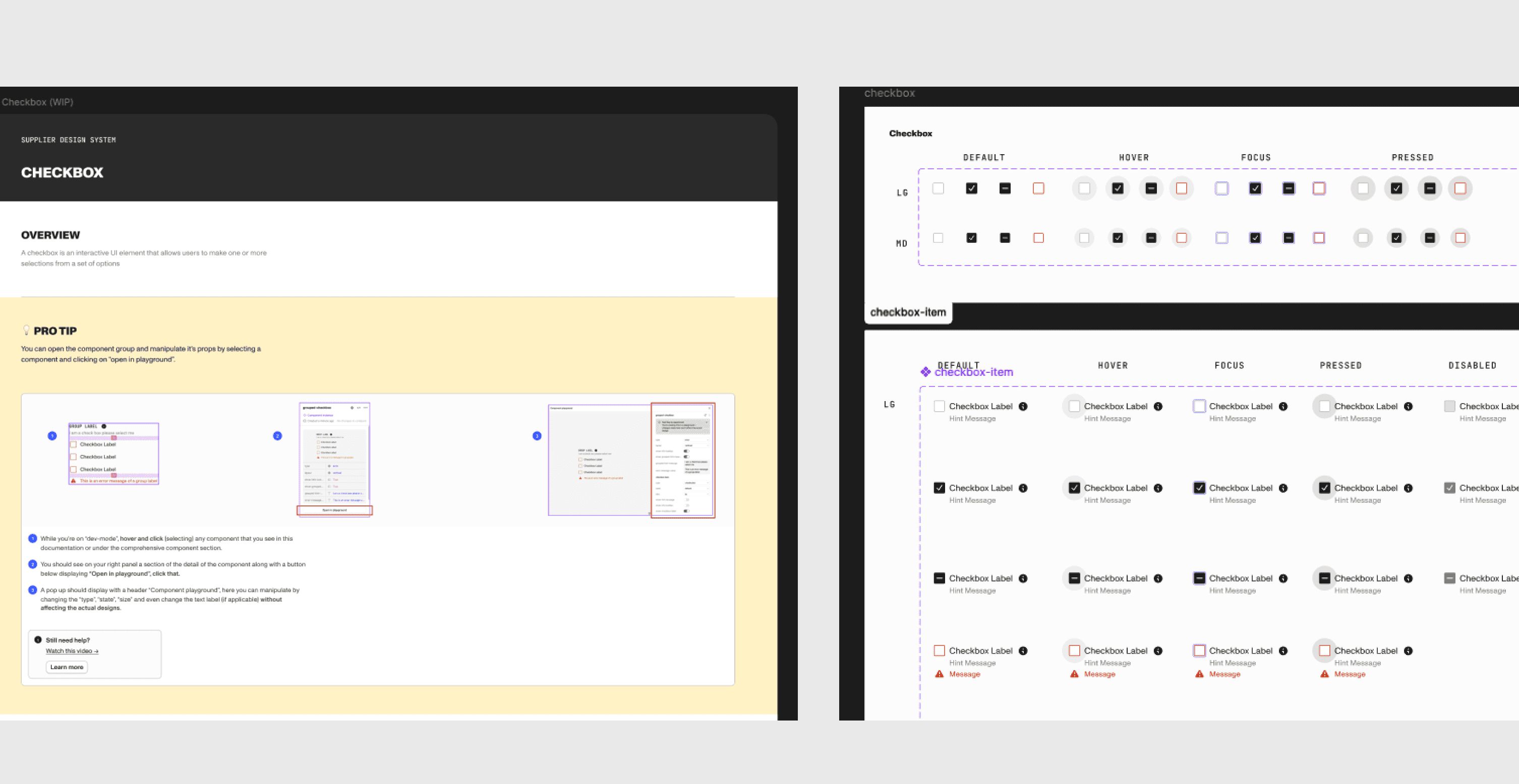
Reusable building blocks with clearly defined anatomy, states, and behavior—such as buttons, inputs, selectors, banners, and table elements. We focused on keeping the component model predictable across design and code instead of creating variants for every possible use case.
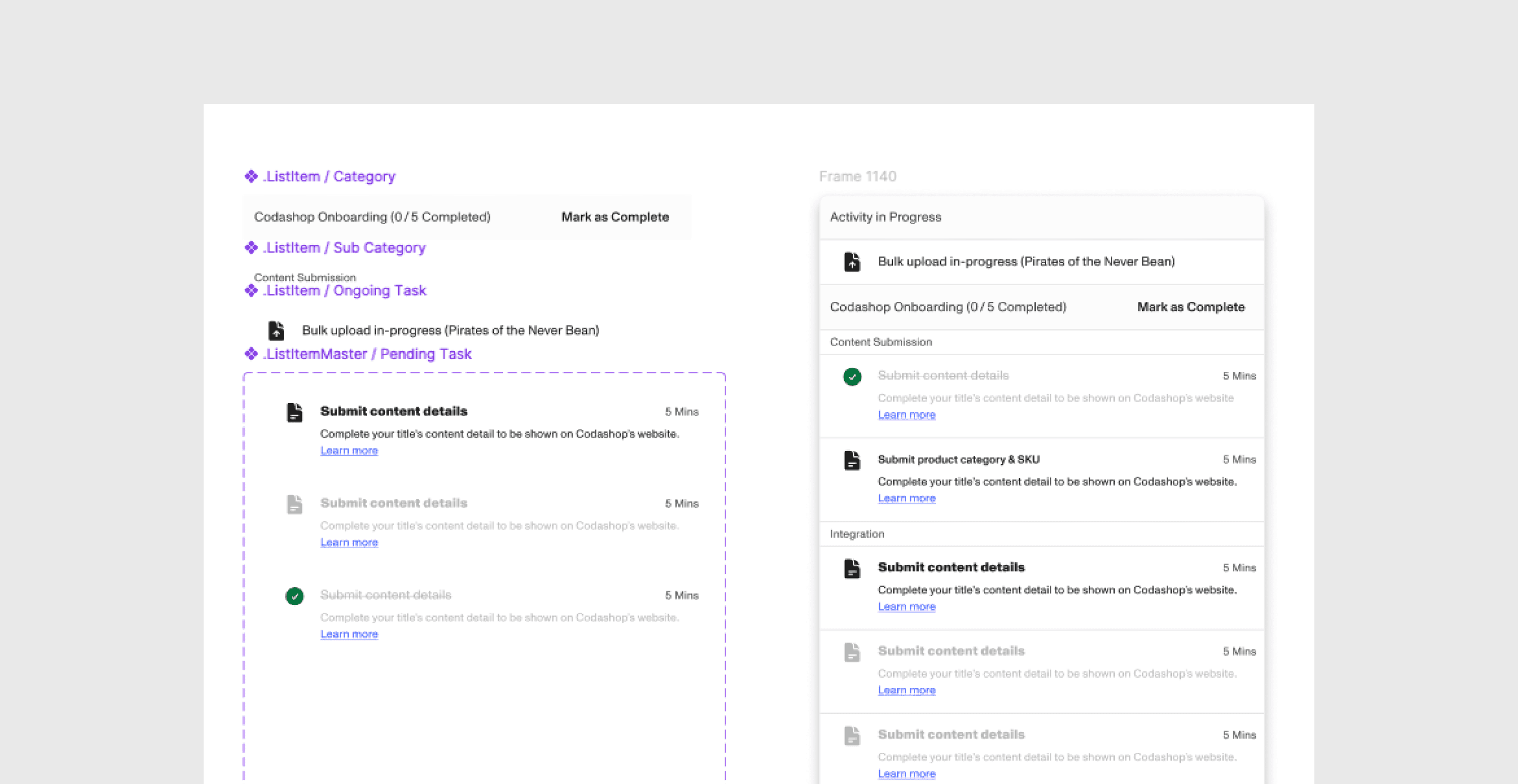
Higher-level combinations of components that solved recurring portal workflows, including dense forms, data-heavy tables, configuration flows, and validation states. Patterns captured repeated product behavior without forcing every screen into the same layout.
Our principle was to standardize repeated decisions while preserving flexibility where product context genuinely differed.
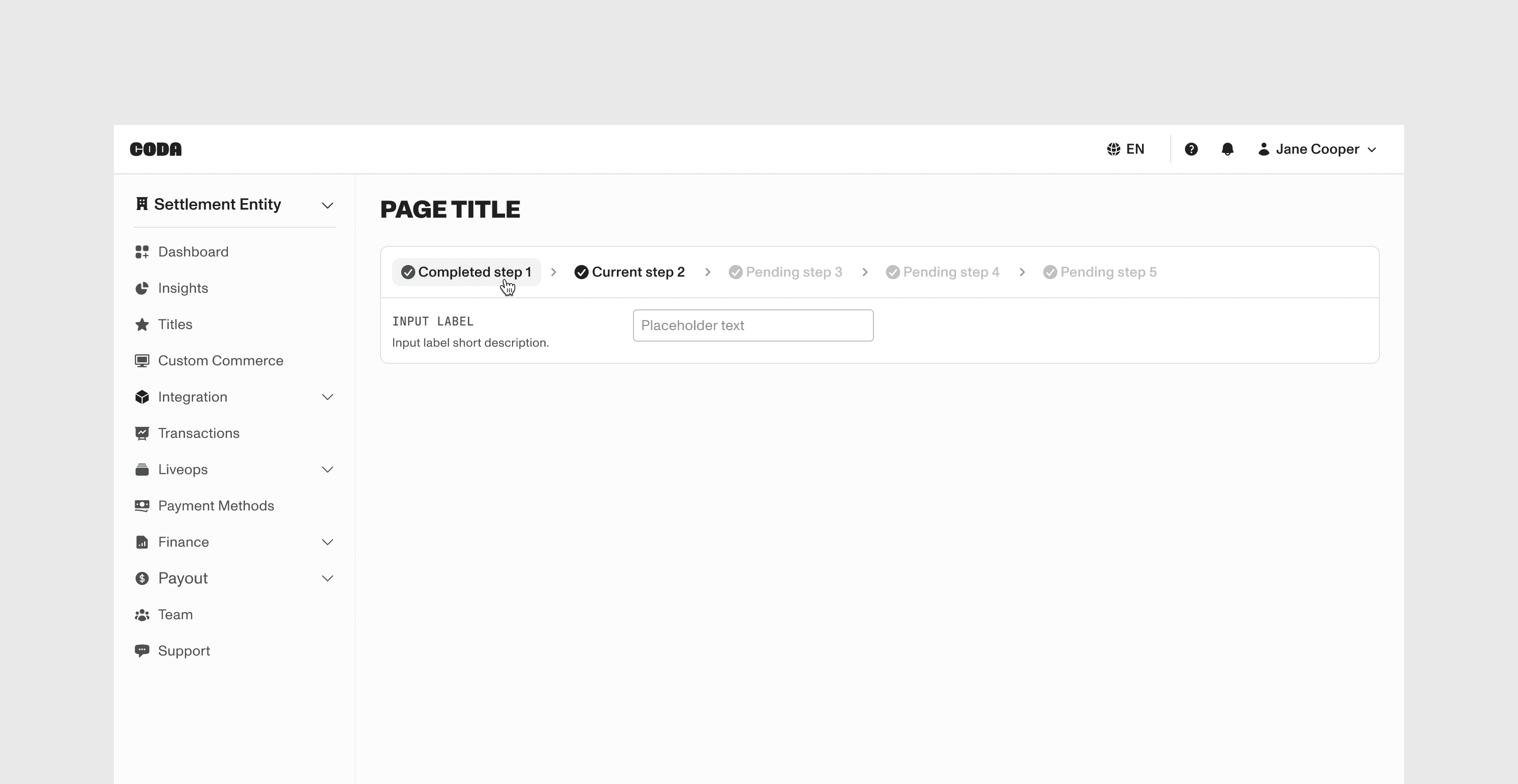
Governance
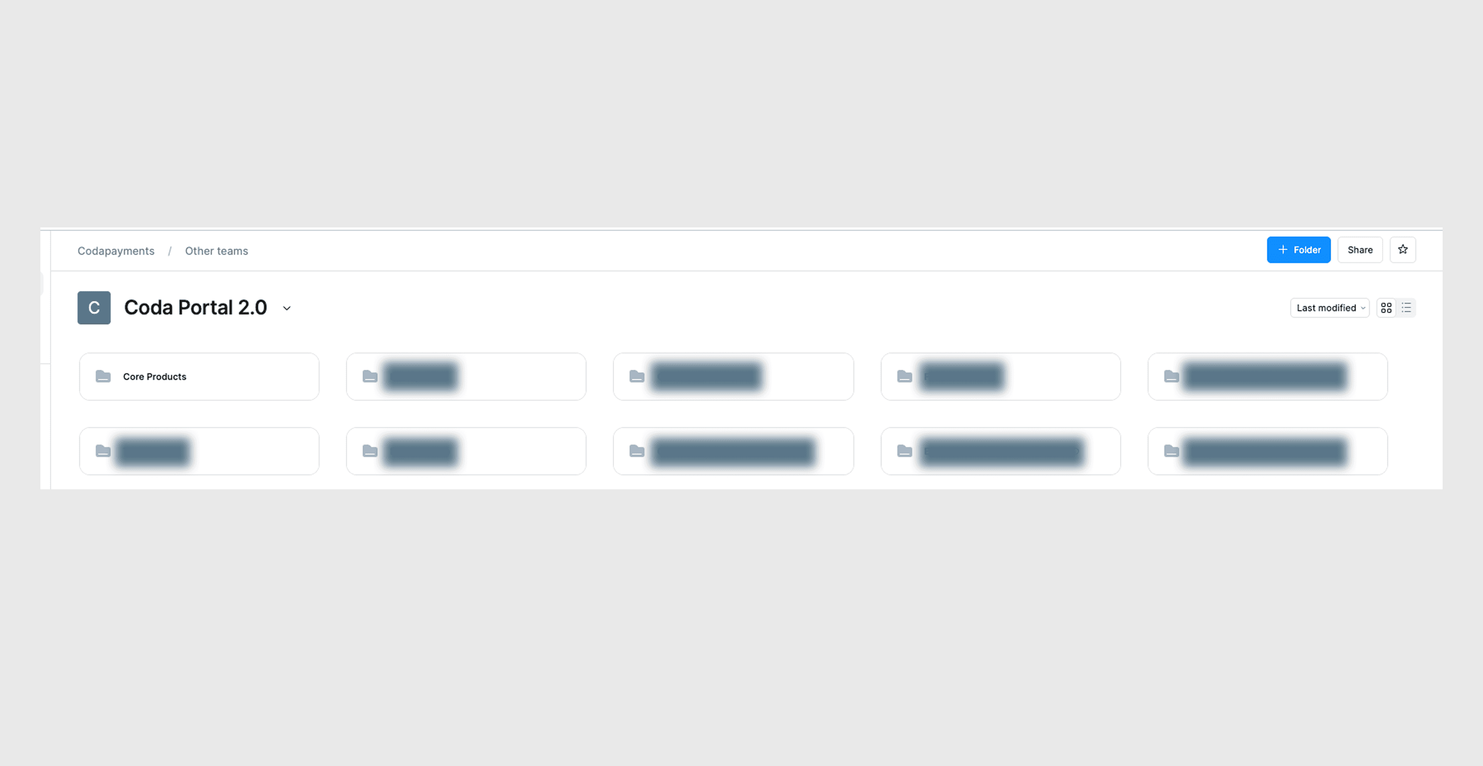
To keep the system scalable without turning the core team into a bottleneck, we used a hybrid operating model: foundational decisions stayed centralized, while embedded designers and engineers could contribute patterns grounded in real product needs.
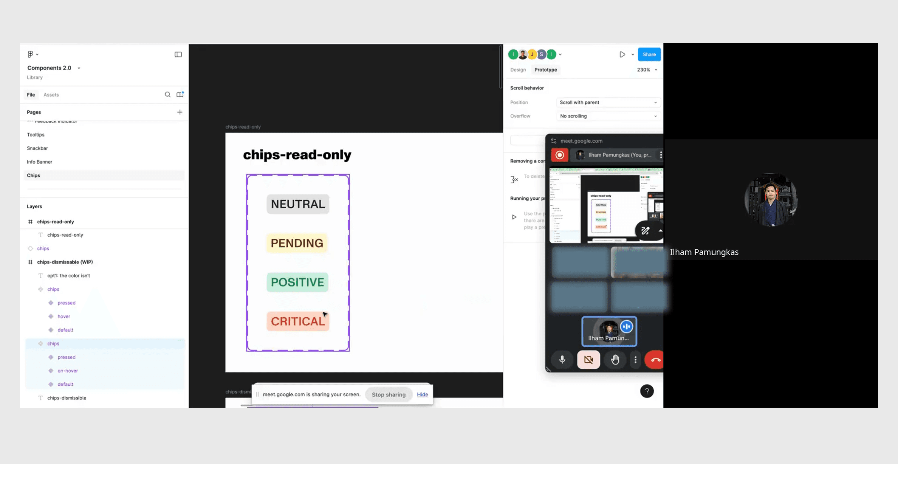
Recurring design–engineering reviews made this model part of the team's routine. We used those sessions to discuss system decisions, product needs, and proposed contributions together.
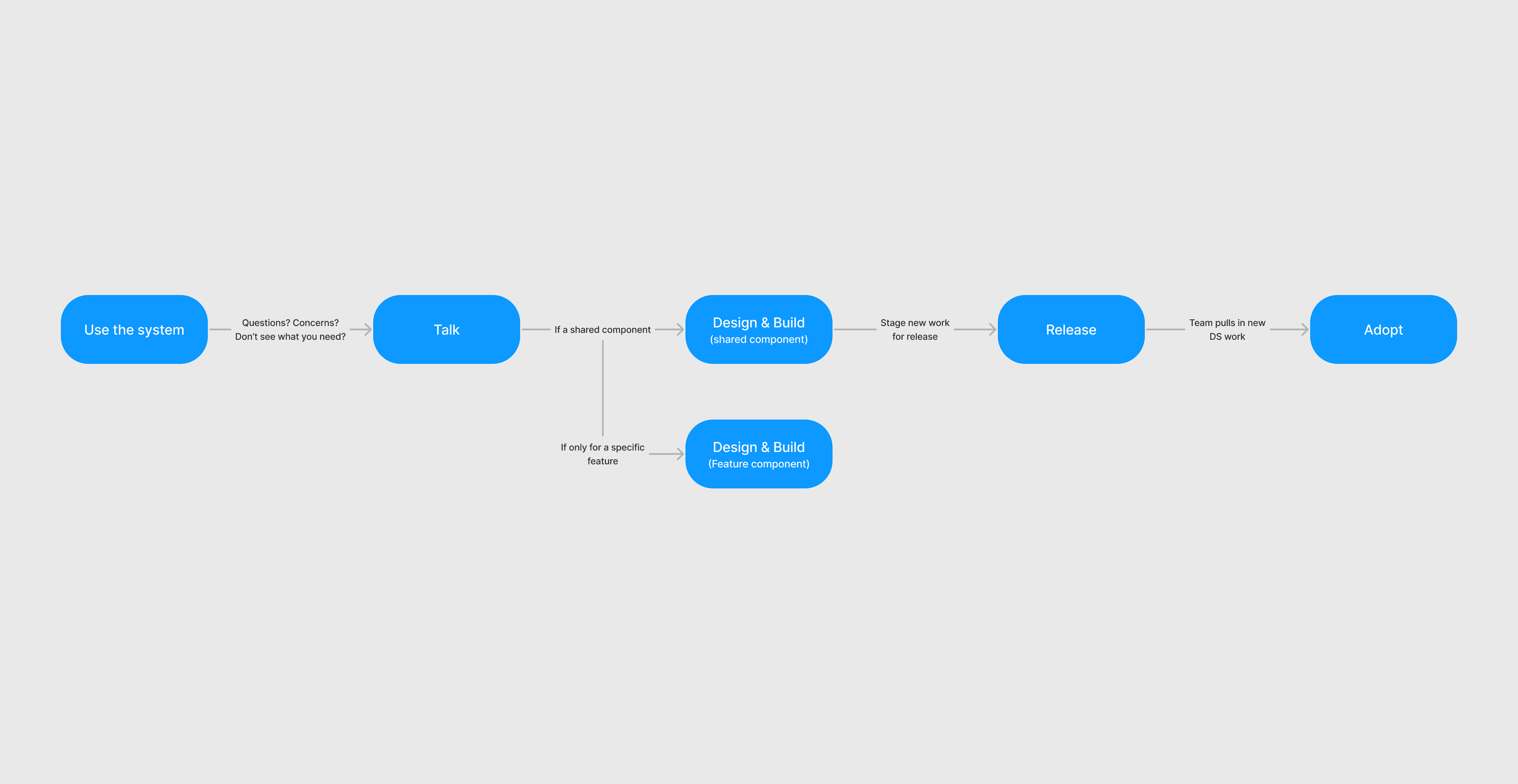
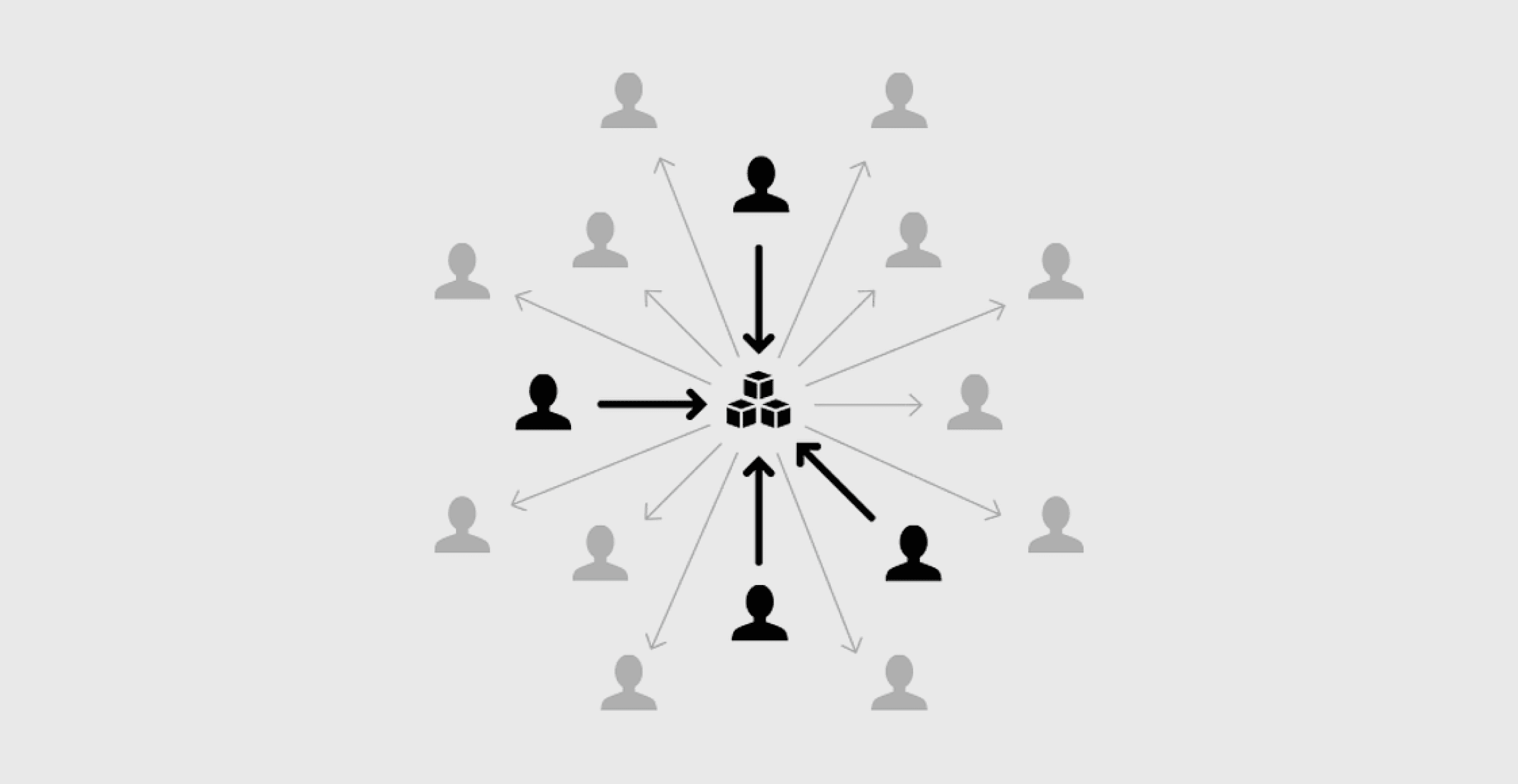
Core tokens, accessibility standards, foundational components, and system-level decisions were maintained by the system co-leads and reviewed through recurring design–engineering governance sessions.
Product teams could bring patterns and extensions into the review when those solutions proved reusable beyond a single feature. The model gave us a stable core while allowing the system to evolve through real product needs.
Migration
We built the system incrementally rather than waiting for the full library to be complete. The work started with foundations, then expanded into reusable components. In parallel, we looked for the smallest changes we could safely ship to the existing portal so it could begin feeling closer to the new Coda brand—especially through color and other high-impact visual foundations.
This created a transitional period where old and new patterns coexisted, but it allowed us to improve the live product gradually while the system continued to mature.
This approach let the live portal benefit from the new foundations while the component library continued to develop. The tradeoff was managing old and new UI together during the transition.
Reflection
We were building the library while the portal's visual direction and onboarding structure were still changing. Shipping foundations first created value before the library was complete, but it also meant old and new UI had to coexist.
On a future project, I would plan the migration sequence alongside the first system decisions: what can change immediately, what must wait for reusable components, and how transitional screens should work. A complete library is only part of the work; teams also need a practical route to adopt it.
Portal and Store represented the same brand but needed different component behavior. Separating their systems preserved the Portal's operational focus while leaving storefronts room for theming and varied art direction. The later Commerce Engine work reinforced that distinction.
I would make those boundaries explicit earlier in a future system: shared brand foundations, product-specific components, and the reason each belongs where it does. That gives teams a clearer basis for deciding whether a new need belongs in the system or in the product.
A centralized core could have become a bottleneck. Our hybrid model paired shared standards with contributions from embedded teams, supported by recurring design–engineering reviews.
For future work, I would define contribution and review guidance alongside the first components: who owns the shared rules, how teams propose an extension, and how we judge whether it is reusable. The system needs a clear way to evolve as well as a clear starting point.
Next steps
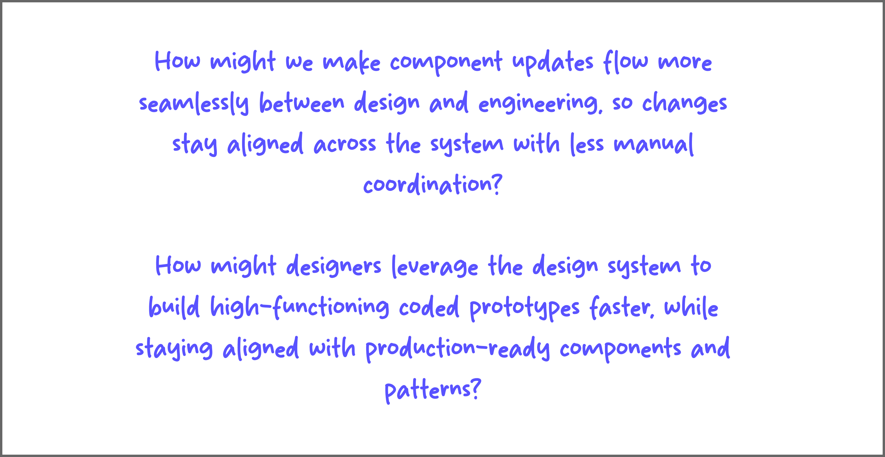
The first rollout established a shared foundation. The next opportunity is to reduce the manual work involved in using and maintaining it.
We are experimenting with AI-assisted prototyping to help designers turn product intent into coded concepts using the system's existing components. This is an exploration, separate from the rollout results above.
Longer term, we want component and token updates to move more smoothly between design and implementation. Any connected workflow would still need review so changes stay aligned across the system.