The brief
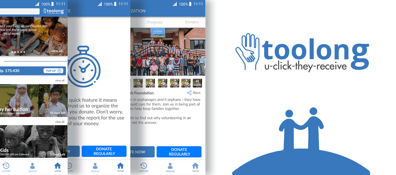
In April 2019, Kargo gave me a design challenge as part of its internship process: create a product that could make it easier for people to donate money. I called the concept Toolong—a combination of “tool” and the Indonesian word tolong, meaning help—and used the line “you click, they receive” to express the original idea.
The objective sounded simple: reduce the effort required to give money to charity. But “easy” is subjective. A short payment flow can still feel difficult if people do not trust the recipient, understand where their money goes, or feel confident that the transaction succeeded.
Researching why people give—and why they hesitate
I combined secondary research with interviews. The desk research helped me form early assumptions about motivation, payment preferences, and common barriers. I then spoke with at least ten people in a public area on campus, covering younger and older participants as well as someone responsible for donations on behalf of an organization.
I documented the conversations in a notebook and recorded some interviews. The sample was small and the segmentation was broad, but the process gave me enough qualitative material to move beyond my initial assumption that convenience was mainly a payment problem.
Mapping the experience
I turned the interview patterns into concise personas and mapped what people did, thought, and felt across the donation journey. The experience map exposed moments where motivation dropped or uncertainty increased.
I grouped those pain points into themes, translated them into opportunity areas, and used an impact-versus-feasibility exercise to prioritize ideas. Because this was a hypothetical product, feasibility required assumptions: I imagined a medium-sized company with limited research and development resources, then evaluated which ideas could improve the objective without demanding unrealistic investment.
The central insight: ease is emotional as well as functional
The project began with speed in mind. The research broadened that definition. People needed a quick path to donate, but they also needed confidence, transparency, and a sense of control.
That led to five product directions:
- Quick Donate for repeat or low-friction contributions.
- Stored balance and e-wallet integration to reduce payment effort.
- Clear information about organizations and fund distribution to strengthen credibility.
- Encouragement and progress cues that make the effect of giving more visible.
- Recurring donations for people who want to contribute continuously.
A donation is not easy merely because it takes fewer taps. It becomes easier when the donor feels informed and safe enough to continue.
From flow to prototype
I mapped the user flow before drawing screens so that the relationships between discovery, campaign details, payment, and confirmation were visible. I explored the sequence with paper prototypes, then translated the selected direction into a higher-fidelity Figma prototype.
The interface focused on the opportunity areas identified earlier rather than trying to become a complete charity platform. That constraint helped keep the concept coherent, even when the research suggested many adjacent possibilities.
Testing exposed the missing orientation
I evaluated the prototype with the System Usability Scale and received a score of 65. That was not a strong result, but it made the next iteration more concrete. Participants wanted clearer feedback about where they were in the donation process, particularly a visible progress indicator.
Some participants were also less familiar with digital donation products than with the everyday apps they used. Familiar interface patterns could help, but the test suggested that familiarity alone would not solve the deeper need for trust and orientation.
What I would carry forward
Toolong was an early case study, and its research sample, assumptions, and testing depth were limited. Still, it changed the question I was asking. Instead of “How do I make payment faster?” the more useful question became “What does someone need to believe before donating feels easy?”
The answer involved payment, but it also involved credibility, accessibility, transparency, progress, and confidence. A stronger next iteration would clarify the donation steps, test trust signals more deliberately, and explore how recurring contributions could feel helpful without becoming coercive.
The project taught me that the most visible friction is not always the most important one. Sometimes the interface is already fast enough; the real design work is giving people enough understanding to move forward.